Student Proposals"The Architect and the Accessible City"Student Proposals Selected for Full-Length EssaysNovember 2012A HOME FOR THE SOULFrom childhood, there are episodes of life affixed to our hearts which superstitiously might be shared with the higher powers we might unconsciously keep interacting with in our daily lives. The Namilyango College Chapel is one of those memories I cannot easily erase. Set up on a hill that harboured a witch’s shrine and is today endowed by two sister churches. The chapel is a monumental building in the school constructed with exposed brick work and designed in t-shape by the Mill Hill Fathers. In 1907, Fr. Philip Jackson the headmaster of the college then became the Pastor of Namilyango Parish; this arrangement meant that the school and the Parish were to be inextricably linked. In September 1912, the parish was once again separated from the school, and that meant that the chapel was to serve the school community only. As students, we usually crave for strength due to the challenges we face and in cases like mine attain it through prayer. I was fortunately able to secure some strength because of the solemn prayer culture of the College. In my silent times on my knees long after dusk and in the early cold moments right before the forenoon in the chapel, I felt ‘her’ listen to my prayers and witness my devotion to my God. In the spiritual moments where I detached myself from the rest of the world, I still failed to completely ignore ‘her.’ The chapel seemed to have life and most of my colleagues thought so too and congregated nightly in great numbers. The chapel with time gained esteem from the students who still relate to ‘her’ in all their activities in school. The ‘mighty anchors’ (the school’s rugby team) has always prayed before any match any pitch. And still had special prayers in the chapel even after a series of loses. During ‘prom’ which is one of the most awaited events in the single sexed school calendar, ‘the walk of fame’ - the school famous walk with the visiting girls around the school towards the place of venue-has to have the chapel stop over where photographs are taken keeping the tradition that would make the future generation believe that it is never prom without the ‘chapel stop over.’ During the 1990s when the college had a strike, many of the students that feared for their lives took refuge in the chapel; since none of the students would dared to harm the chapel which was not the for the other school structures. The chapel has always earned some of its value through the tales that is passed on to the new students in the school. One of the amusing tales is of the ghost of Father Kuipers- a former school headmaster who died in 1991- that moved towards the chapel at midnight not until his remains were moved next to the chapel. My essay is intended to show the significance of the chapel to the Namilyango College lives. A home on the way homeIt is easy to come to think of libraries when discussing public architecture. We’ve had public libraries in Sweden since the early19th century and they’ve grown to be one of the most permissive places in the society. Growing up in a small town I remember the library being my home away from home – a place to go to after school to read magazines, look through comic books and find out more information about subjects I didn’t even know I was interested in. The architecture of that library wasn’t much to brag about – a dark brick building facing the stream with glazing from floor to ceiling on one of the walls and a sharp distinction between the grown up section and the children’s section, but there are numerous examples of buildings where the architects have used the permissive concept of the library and turned it into great architecture as well, one of the most known in Sweden being Stockholm City Library by Gunnar Asplund. The form of the library has developed through the years. At the beginning of the 19th century, they had closed bookshelves and you had to ask the librarian for the book you wanted. The Asplund Library was one of the first to have open shelves where you could browse for and pick out the books you wanted yourself – an important step towards the accessible library of today. Sture Library is quite different from the famous Asplund Library – both in size, placement and structure, but it has, like the Asplund Library, taken the library, as an institution, to yet another level of accessibility. Sture library is located inside the subway station at Östermalmstorg in Stockholm. Cecilia Aronsson of TEA is responsible for the interior design and it has been rewarded the Stockholm Chamber of Commerce Urban Environment Price. The price may be prestigious, but even more telling of the libraries impact on the public is the ”opinion-book” that has been displayed on a table since the grand opening in may 2009 and had generated 67 pages of positive reflections by the fall of 2009. The library is located at a mezzanine level inside the subway station. To make sure that the public finds it easily accessible, it has two entrances and it uses mirrors to communicate the books on the shelves to the commuters. TEA, themselves, says that ”focus has been on creating a quiet haven for people in motion”, but the Sture Library does more. By placing it inside the station Sture Library has taken my childhood ”home away from home”-library to a new level. It has become a ”home on the way home”-sanctuary. In this essay I will continue investigating the library as a building for the public good, with a focus on the new level of accessibility and openness that is Sture Library.
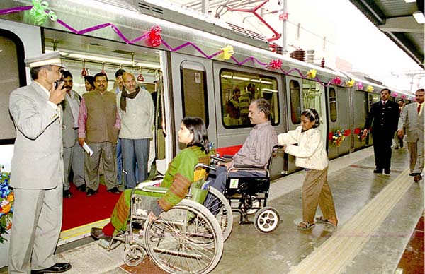
A place for pause in the city of paceImagine being in the midst of a city in which millions of activities take place every minute, where an individual disappears into the multitude in the blink of an eye. Draw up a picture of the things that hit you first when you think of Mumbai. Imagine crossing one of its railway stations, or driving through the Queen’s necklace. Visualize a walk through the famous Oval Maidan, or the Dhobi Ghat, or a night bazaar. Imagine watching the Ganesha idols being immersed or fire crackers being set off at one of the promenades during a festival. Now imagine experiencing all this with your eyes shut. The way in which one connects to one’s immediate surroundings and to urban ambiences is very different for somebody who can hear, feel and touch but cannot see. If there are any chances for an individual with a challenged sight to survive in a city like Mumbai, these alternate senses need to be highly sharpened. The ‘Happy Home and School for the Blind’, situated right in the heart of Mumbai, trains such individuals in doing precisely this: to feel the city without being able to see it. The building is ironically located between a shopping mall and an art gallery, opposite a series of showrooms. It is a building that cocoons its inhabitants and programs enough for their protection, but at the same time takes care as to not cut them off from the urban fabric. It is a building that takes only what it needs from the city; one that carefully mediates the outside with the inside. The home and school for the blind is, first and foremost, an environment. It is a building that consciously addresses the comforts of its users and whose primary reason for existence is making its users ‘feel’. Feel light hearted. Feel familiar. Feel confident. The building moderates each parameter as per the requirements of the program, whether it is sound (for the music rooms) or light and colour (for the classrooms and workshops) or a gradual gradient in the slope of the floor (for the passages). The building understands the needs of its users, and addresses them successfully enough for its community to be able to carve for itself a niche in the impossibly catastrophic fabric that surrounds it. In Mumbai, there are very few things that last. It is very difficult to create dominant assertions, let alone subtle gestures that will live on through the decades. The formation of communities is a natural phenomenon in one of the world’s densest cities: there are groups for castes, cricket fans and Bollywood actors, to name just a few. However, this particular community, although not representative of the city unlike the others mentioned, suggests a gentle yet lasting tweak in an otherwise chaotic setting. And it is able to do this, largely because the building that houses it defiantly protects it, by creating a sensitive ambience for it rather than a pompous statement for others. A Sanctuary for Expression and TransformationVisiting Centre for Environment, Planning and Technology, Ahmedabad is a must for any architecture student. My initial visits to the school remain a memory deeply etched in my mind. Piquing one’s curiosity, it makes one ponder; what sets this place apart from its many contemporaries? The place, the people, the culture or its ethos? With passage of time, the fog lifts. One begins to realize that the soul of this campus lies in its profound sense of purpose and a resultant architectural vocabulary. Rarely does one witness architecture that is imposing yet porose; giving a sense of order yet liberating your thoughts. Sitting on the North lawns of the campus, my mind tries comprehending the enormity of this thought. I look around at the milieu of Khadi clad students and wonder if they would concur. I turn back to notice the exposed brick structure hidden behind a band of trees and seek clues that might resolve the questions in my head. ‘When does a room become a space? Why do people associate themselves with a space? How is a collective conscience formed?’ Founded and designed by Architect B.V. Doshi in 1961, CEPT, Ahmedabad is one of the premier educational institutes in India offering undergraduate and postgraduate courses in Architecture and Planning. The architect envisions an education without doors, like a street with numerous vistas for one to learn without boundaries. Not only is this palpable in the studios which breathe in light and air owing to the north lights but also along the staircases which entice you to walk alongside and experience the space exactly as the architect wants you to. The lawn covered mounds at the entrance, the interplay of levels throughout the campus, the cantilevered balconies; all seem like a part of a narrative. I find myself spiraling back to my history books. Architecture is but an idea in brick and concrete. It talks of human mindsets, of ambitions, of lifestyles led and of lifestyles pursued. It is when the aspirations of the architect and the user blend, that architecture happens. In present times, not only do Indian architects have the responsibility of creating a unique architecture that reflects our progress and stature as a country but also one that respects and imbibes our culture. CEPT, a union of social sensibilities and practical knowledge housed in an equally inspiring campus, has become synonymous with the architectural scene in the country so much so that it is today known as the Mecca for the architectural community in India. Not every day does one come across architecture which transcends from being merely prosaic into architecture that keeps a collective conscience alive. After all, architecture that makes you ponder and introspect is priceless and one that is truly for the public good. All around me I see people; I hear the hustle bustle of a community immersed in conversation. At once, I feel like a part of the bigger picture, a cog in the wheel. I feel reassured. This must be true Architecture. AADI-Beginning of a Journey Towards Inclusion“I thank God for my handicaps, for, through them, I have found myself, my work, and my God” -Helen Keller While architecture today is being viewed by many as solely a profit-making industry, replete with extravaganza and splendour, rather than a humble profession which aims at serving the masses, it still remains the single most powerful means of carving out civilised societies out of raw ones. Civilization, in turn, calls for efforts directed at inclusion of the entire populace within the societal fabric with equitable access to services, development & opportunities to everyone. In India, as in other developing nations, the disabled have been facing a certain kind of bias. While many constitutional reforms have been made to improve the condition of disabled people like “The Persons with Disabilities (Equal Opportunities, Protection of Rights and Full Participation) Act 1995” they have failed to change the bigger picture. The problem lies not with the reforms but with their implementation. Negligent architecture and a generic apathetic mood also play a pivotal part in the advancement of this vice. However, the picture is not entirely gloomy and certain examples stand out as sources of inspiration to utilise architecture for the common good, and in this particular case for the betterment of spastic children. AADI (Action for Ability Development and Inclusion) School is run by a Delhi based NGO founded in 1978 which has been constantly working for the integration of spastic children in the society. It was designed by Architect Romi Khosla in the year 1995. The school design incorporates ramps, wide entrances, special toilet facilities etc. which makes it an amicable place for the spastic children. Being India’s first custom-designed school for such a purpose, it provides specialised training and facilities to children to channelize their energies towards skill development so that the children are able to have a better control not only over their lives but also on the society and, thereby, prevents them from exclusion and stigmatisation. Our essay discusses these features in detail. In addition: -It also focuses on the site of the school i.e. the school is located in Hauz Khas area of Delhi and, hence, lies in the vicinity of the best engineering institute (IIT) & the best medical school (AIIMS) of the country and tries to appreciate the impact of such a location on AADI School. -The influence the school has had in shaping the architecture of the public facilities of the adjoining areas (especially on the designing of the Delhi Metro Rail system with particular emphasis on the adjacent Metro station i.e Green Park Metro Station). -The essay also lays out steps which can help AADI School become a source of inspiration to promote architecture, throughout the country, which is responsive to the needs of the disabled children; who otherwise have to face exclusion and difficulties because of the prevalent architectural apathy that gives no thought to the needs of the disabled people. Architecture embodying a Conscience in an Unforgiving Urbanity - Gandhi Ashram, Ahmedabad“Wherever he trod became hallowed land, wherever he sat became temples.” – Nehru’s tribute to M.K. Gandhi. Gandhi, India’s ‘Father of the Nation’, the man who inspired a generation; uprooted the imperial colonisers so his countrymen could breathe a free air; all without any form of violence or aggression. The idea of a non-violent revolution that saw success with Martin Luther King Jr., Nelson Mandela, and more recently in Egypt, seems to go against the primary human instinct of self-defence. It requires unfathomable mental strength, tolerance and patience. These virtues emerge when the mind reaches the zenith of ‘enlightenment’. The ‘Sabarmati Ashram’ at Ahmedabad, India became the launch pad for many a ‘non-violent’ movements. It was no palace by a master-builder, but a cluster of rudimentary hutments; primarily a means to organise protesting mill labourers to construct a hand-weaving textile workshop where they would be self employed. Since 1917, the ‘ashram’ grew in an accretive manner, always self built; until 1963, when the architect Charles Correa built a museum to the great man on the same campus as his ashram. This new addition to the ‘ashram’ bore the huge responsibility of showing respect, but at the same time embodying the spirit of this humble, loincloth clad man. In 2011, this ‘museum’ to Gandhi, finds itself in a metropolis of 5 million people. The ashram has transformed itself and is not merely limited to a historical or a nostalgic realm. It is not just a museum to glorify one man by means of distancing people so as to create reverence, but an embrace into the fold to gain a spiritual realization. It is not where one feels stifled or controlled or is forced to behave in a particular manner but has the liberty of loitering around aimlessly in the tranquil, however the conscience being continuously informed by those values that the place immortalises. Benches find themselves neither as a lounge, nor as a spot to admire the exhibits, but a seemingly aimless pause where more often than not, people find themselves lost in thought or reading. Correa’s building too, is a grid of huts in brick and wood; surpassing the imposition of grandeur on people, the ‘built’ melts so much, that at times the campus feels like a park for frolicking children, often enjoying the affectionate embrace of Gandhi’s statue that sits in penance atop a gentle mound in the landscape rather than on a lofty pedestal- reinforcing that all men are equal. Beyond the intangibles, it also serves as a hostel for ‘under-privileged girls’, a research centre for self sustained hand spinning/weaving, encouraging rural industries among others. In this capitalistic urban context of consumerism where everything from gadgets, cars, entertainment , even ‘yoga’ and ‘spirituality’ has to be consumed; ,such a realm of an unsaid spirituality and reflection is quintessential for mankind to redeem itself. An Architecture for the public good that cradles the intangibles of human existence, whilst reinforcing its very tangible foundations of serving mankind, keeping alive that spirit right from the inception.
Building Street Dreamscapes: The Durga Puja Pandal at Kolkata“Public realm is a process, not an end-product.” - Richard Sennett Wandering through the streets of a neighbourhood of Kolkata, the Indian metropolis familiarizes me with its essential imagery, though not a much-publicized one. The street abuzz with people, taxis and rickshaws leads me towards a six-metre lane. Back-to-back well-built and rusted-tin-roofed houses characterize the lane. Sky for inmates is the three-by-four-metred windows, through which they chat across streets. These are the regular greys of the neighbourhood at Hatibagan locality in North Kolkata. This picture is about to be coloured! Three months prior to Durga Puja, the neighbourhood readies to build its Pandal. Durga Puja is the annual celebration of Goddess Durga or Mahishasuramardini (Demon-Slaying-Warrior-Goddess) during September-October over five days and nights. A Pandal is a temporary shelter that houses the Goddess idol during the festival. Bamboo, timber, ropes, hay and clay get collected at the street corner. Transformation begins. People of the neighbourhood, irrespective of age, gender, occupation and religion gather to dream and debate, “What will our neighbourhood become this year? What experience do we portray to the world through the Pandal? Will it have a theme? How much do our means permit?” An artist, Sanatan Dinda arrives with his team of craftsmen. The streetscape transforms into his studio, rejuvenated with neighbourhood children kneading clay, sounds of tools and discussions of curious passers-by. Tools mould materials; dreams become reality; the Pandal emerges gradually. The festival arrives. A beautifully lit world in an entirely different space-time is born. In the midst of intense drama, people, gates, undulating mud-bamboo walls and a ramp towards a towering form, my heart pounds in anticipation. I reach an intricately crafted space. The crafts are alive! The Pandal is a live museum! Beyond mesmerizing ritual sounds and movements, is the image of Mahishasuramardini. New life has been created, the demon slain. The entire neighbourhood is on the street, merry-making. Their Pandal is their pride. This world disintegrates as the festival ends. What stays is people’s renewed passion for life ahead. This is the pictorial landscape of thousands of neighbourhoods in Kolkata. Community-Pandal-making is a two-century-old concept of people’s desire to explore their collective right to the city. ‘The Pandal’ is a medium to stage, shape and transform public opinion by stimulating dialogue, debate and confirmation. It is an expression of appropriation, community-formation, popular trends and cultural, political and artistic influences – constituting a ‘Public Realm’. Though the idea of being inhabitable, usually regarded primary for a building is lacking, the process of building the Pandal acts as a ‘sign built within the human environment’ (Egenter, Nold) The essay proposes to explore an Indian community’s search for identity in the midst of diversity, the search embodied by the very act of building. It would recreate the Durga Puja phenomenon and the facets of building the Durga Puja Pandal. It would unravel the almost-theatrical tradition of such an act of building that is the backbone of public life of neighbourhoods of Kolkata – earthy, expressive and sacred, simultaneously, robust and dynamic. Creating a New Dialogue with an Old CityModern architecture in a historical setting is often ridiculed. It is a difficult challenge that should not be taken lightly, as it requires a constant mediation between the desire for new and the love of old. So imagine the obstacles which lay in front of the architects commissioned to design a modern shopping gallery directly in the center of Innsbruck, a small romantic city in the heart of the Austrian alps which dates all the way back to the Stone Age. Such was the challenge of Dominique Perrault Architecture, the firm responsible for the Rathaus Gallerien. For the past two months I have been fortunate enough to live in Innsbruck while doing an internship here in the city, and I can personally say that the Rathaus Gallerien appeases both my idealistic view of the historic town and my architectural hunger for new design. The Rathaus Gallerien makes a presence within the community without being offensive to the surroundings. The main entrance is beautiful in its modesty; while the large steel and glass sign announce the presence of the interior space, the entrance does not attempt to confront the traditional surroundings and instead the main façade blends into the Maria Theresien Strasse, the central shopping street in Innsbruck. The gallery itself consists of two central corridors running perpendicular to each other, creating a cross formation and four distinct ways into the complex. This simple composition of straight corridors allows the gallery to be hidden within the shopping district from the outside, the entrances being the only indication of an interior space. Within the Rathaus Galerien are several important spaces. Besides the small boutiques and bakeries which line the corridors, a notable purpose of the gallery is that it houses the new city hall, whose modern facades are embedded in the gallery and the interior courtyard which faces the North side. But the most sensational view is seen right in the middle of the gallery. Standing in the central corridor, one looks up along the sides and sees the old facades of the adjacent buildings, which, while new, are reminiscent of the area’s typical exterior facades, and now house hidden office spaces overlooking the gallery. However floating atop these traditional facades is the modern multicoloured-glass and steel canopy, which seems to both compliment and contrast these weathered-looking facades. It is a fun way to create a central, enclosed shopping area while respecting the buildings that stood there first. As a city grows and changes, its basic needs change as well. Population increase, a pique in tourism, and the desire to compete with surrounding cities meant there had to be an architectural intervention in the central area of Innsbruck. Because of how it mediates between the need for new with the nostalgia of old while providing retail, government and commercial space, the Rathaus Galerien is an example of new construction that can transform an important community area without challenging the existing architecture that people love. Empowering DesignIn a world that operates primarily on a visual understanding of one’s place in space, an architecture that creates objects of visual seduction predominates. With such an emphasis on the visual impact of a building and the desire for the creation of visually memorable spaces, designing for the visually impaired poses a particularly challenging opportunity to develop a design strategy that can involve all of the senses simultaneously by creating a multi-dimensional experience of space – a challenge that the Linburn Centre by Page\Park Architects has risen up to and met. The Linburn Centre occupies an interesting dimension in that it is effective in being both a visually exciting structure and wholly adapted to the unique needs of its primary occupants, the visually impaired. The Centre is operated by the Scottish War Blinded and caters to veterans who are blind or who have partial vision caused by their tour of duty or by old-age. Its primary goals are to provide rehabilitation and life skills aimed at moving the veterans toward a more independent lifestyle despite their ailments. A major success of the Linburn Centre is in the simplicity of its plan, which allows one to easily form a mental map of the building making it easier to navigate without assistance – a key aspect in promoting independent living. A sensitive approach to mobility sees a large circulation spine run the length of the s-shaped building with a continuous handrail to provide extra support and direction; and outside, the terrace and sensory garden are seamlessly connected. In addition to a social gathering space, the centre’s facilities include a metal and wood workshop, art space, gym, therapy rooms and a remembrance room which are all organised along one side of the circulation spine. Bright colours and bold architectural gestures mark the entrances of the various rooms, making them more discernable for the partial-sighted visitor; while the materiality of wall surfaces changes as one moves through the building, providing a texture map of location. Many of the elements in the Centre have been designed to address difficulties with mobility resulting from visual impairment, but the Centre would be just as effective in catering to individuals with other disabilities or with no disabilities. In my essay I will explore how the visual presence of the Linburn Centre, which represents a vision-less community, has been able to adjust pre-conceived ideas of living with a disability in the community — especially as so many of Edinburgh’s buildings are not easily accessible. I will discuss the significance of designing for a community whose disabilities have arisen later in their lives as adults, and finally, how integrating the senses in this design has allowed for a more inclusive environment that enhances the lives of everyone in the community. Designing for the public good comes full-circle in the Linburn Centre: a design that can uplift and serve a special community which has uplifted and served its country is one that, in the end, serves us all. Gaining IdentityTucson is a vibrant town, alive with culture both ancient and contemporary. It is a town at war with itself, wishing to be of the barrio and of the suburb, of the Hispanic culture and of the Anglo-American culture. Thus, it is a rare building that can unite this community; that can weave cultures, traditions, values, and beliefs together into one rich fabric. The Historic Y is one such place that has the strength and ability to bring together this diverse community. Built by Annie Graham Rockfellow in 1930, the Historic Y is made of more than just whitewashed adobe; it is made of mutual ideas and shared beliefs. It provides the background for a multitude of community events that bridge the gaps between age, culture, and religion. From its location to the events happening within its historic walls, the Historic Y is a hub of activity. Prominently located near some of the most active parts of Tucson including Fourth Avenue and the University of Arizona, it becomes an important gathering place. But its significance stems from more than its location, it comes from the weight of what it stands for. It is home to architectural professionals, community service organizations, preforming arts groups, farmer’s markets, and classes. This space is so effective because the diversity of the groups using the space translates directly to the idea of coexistence, collaboration, and camaraderie. It is an excellent example of how much stronger place is, and how much stronger a group is when it consists of a fusion of many ideas rather than just one single idea. Tucson is such a melting pot and as the Historic Y so admirably demonstrates, embracing the diversity will make the whole much stronger. The constant stream of activity at the Historic Y is what makes it so successful; it has an intensity and energy that could not be found in an environment with less activity. This vigor is what not only draws people in but also what entices them to stay. And the true beauty of the Historic Y is that the people served by the Y are as diverse as the activities that take place there. It is a place of community gathering that opens doors to every person in the community. It provides opportunities for learning, for performing, for growing, and for developing new talents and skills. The importance of community is undeniable. Communities provide people with a feeling of safety and a belonging. Tucson is a multifaceted, sprawling town that needs to find a stronger sense of identity and kinship. The Historic Y is a stepping stone in that direction. Change comes slowly, but it comes from strong convictions and the belief that what you are doing matters. Tucson needs to find peace, to unite its intricate layers of people and beliefs. The public significance of the Historic Y is that it is a community, it represents solidarity and fellowship. It has brought people together to mature, to discover, and to bring change to Tucson as a whole. Generous Architecture at Yerocham Public LibraryFrom the moment one has gone over the great trauma of being born into this world, one long for a place where he can recall the warmth and comfort he just lost for life. This desperate, sometimes unaware, journey is what makes Sara, a struggling single mother and a friend of mine, drive a carriage on for a kilometer or so in the streets of Yerocham, a small town under the desert heat of the Israeli Negev. The staring eyes of the silent surrounding horizon penetrating the streets through their uncertain boundaries have an intense compelling influence on her. In this state of unease, she tries to escape that revealing glare for a while. She finds a daily relief at the public library, along with dozens of other members participating in this forced community of shared fate. Most of them did not choose to live here, far from any city. Some of them are immigrants, some refugees. A colorful, surprising social tapestry naturally weaved as diverse identities which generate various conflicts, rarely melts down into a compassionate human togetherness facing the same overwhelming difficulties. The public library and its architectural properties inspire those fragments of favor to occur on an everyday basis. The public library serves a great deal of aid already in its function. It is accessible to everybody and Membership is free of charge. This invites even the most suspicious and vulnerable person to try and attend the library. We were encouraged to enter the shaded, cool haven undisturbed, wonder along the book aisles and roam the realms of our hearts and mind - and then leave, maintaining our anonymity. But we did not want to remain unknown. The library consists of three wide spaces and their specific features; the main library, the archive and research sections at the top gallery, and the children's library and games floor – watching over one another, flowing casually toward each other, furnished with pleasant tactile wood and fabric, intelligently lit using natural and artificial, direct or indirect lights. There, we felt comfortable, and most important, welcome. At this point I noticed a magical quality of architecture – Its ability to generate paradoxes which mirror our innate contradicting selves. There was something about the unique mixture of precise planning and the movement of letting go, which made us experience the duality of the place as a labyrinth and a home, indifferent and exciting, cave-like sanctuary. For the people of Yerocham, the public library donated new orientation in time and space. It first became a shelter in the full sense of the word, and then carefully opened our hearts. There, I understood that in order to fulfill its elementary purpose – granting us a place designed in our own image, coherent with our fears and hopes – architecture is meant to reach a level of vacancy. Generous architecture is capable of preserving its special characteristics while undergoing a process of retraction, humbly taking part in the act of giving birth to the wonderful grace of human intimacy. Holding the Threads of a Fading CommunityStep off the busy Dr. KG Hedgewar Marg on the roads of New Delhi and you will find yourself in the narrow lanes of a colony named the Samyeling (a place beyond conception) Tibetan Settlement. The settlement is part of a larger area known as Majnu ka Tilla. This strip of land on the riverbanks of the Yamuna was allotted by the first Prime Minister of India; Jawaharlal Nehru to Tibetans fleeing Chinese oppression in 1959. Presently the refugee colony houses close to 2700 people predominantly Tibetan exiles and second generation Tibetans born and raised in India. If Dharamsala in Himachal Pradesh is the religious centre for Tibetans living in exile in India, Majnu ka Tilla is their commercial hub. It acts as a link for people visiting Dharamsala providing bus services, accommodation and a place to savour authentic Tibetan food and culture. Here space assumes a new dimension with congested streets, cramped balconies and cafes that jostle for space with trinket sellers, blacksmiths and red robed lamas (monks). Amid the swishing of the prayer wheels and the wafting aroma of tasty momos (filled dumplings) lies the main monastery of the settlement. Religion is part of daily life for the typical Tibetan and has shaped their identity. The monastery in Majnu ka Tilla build in 1963 was the focal point from which the colony took its growth. From being a simple structure made of bamboos and scraps of metal the concrete and wood clad monastery today bears proud testament to Tibetan architecture and the social function it is expected to perform. The building was a community effort that included the whole Tibetan camp pitching in with the design and construction work. It is also one of the few examples of Tibetan architecture in New Delhi, ornately decorated bands on the parapet, the striking colours, serene beautiful interiors which house Kangyur and Tengyur collections of texts and intricately carved wooden brackets and capitals are examples of Tibetan architecture. The deers atop the monastery indicate the power of Buddha’s teachings that attracted the most pure of animals and the Eight-Spoked Dharma symbolises the Buddha's role as one who changes the course of destiny through his teachings. In addition to being a vanguard of a fading Tibetan architecture the monastery is also one of the few open spaces in the colony. The cobbled courtyard in front of the monastery is an active social space where; by evening children play badminton while the older Tibetans sit on the benches and observe the languid pace of life here. On Fridays the square gets transformed into a mini carnival, all residents gather to gamble beneath the shade of huge tarpaulin sheets while they are refreshed with frothy chang (rice beer) and tasty momos. This is a community, whose life; art, culture the very soul is being slowly extinguished, the monastery in Majnu ka Tilla is one structure that I feel can revive the whole exiled Tibetan community and bring it together. HOPE BROUGHT CLOSER.The Epicentre is a wonderful structure that supports a cluster of villages towards improved life. An Epicentre is a point on the earth’s surface where the effects of an earthquake are most felt. It radiates to surrounding areas causing tremendous damage to the earth’s surface. The Epicentre concept was established in 1977 during the rising debate on world hunger. It was initiated by the first Rome world food conference to find a solution that reached out to poor people in rural areas as a strategy to fight hunger. It’s on this concept that the facility is founded; to radiate hope to the poor, help struggling rural occupants and also awaken the spirit of the different clusters so as to eradicate poverty. The “L” shaped Epicentre in my community, primarily located in central Uganda Wakiso district approximately 4km from Wakiso town. It’s located next to the NSSF (National Social Security fund) land and the former Ugandan Prime Minister Kisekea’s home. It is run by the people from the Temangalo, (name of the village) in which it’s located. The building contains several units: a dispensary, a rural bank, a nursery school, food bank, community hall, village shop and a library. Over a five year period, an Epicentre becomes independent- it is able to run its own activities and no longer requires financial investment from the Hunger project. The scheme used for the design was generated by Global Office, whose headquarters are in New York. Alfred Joel Mulwana from Planning and Design Uganda implemented it. To date, poverty hinders development in rural areas. Introduction of an Epicentre has guided rural communities not only in Uganda, but all over Africa to eradicate poverty and empower men and women. The Epicentre has given the locals hope, strength and has also encouraged them to work hard. It targets people of all ages thus creating unity amongst the community. Farming being a major activity all over Uganda, different types of farming have been practised which have enabled locals to generate some little income to sustain themselves. Through the Epicentre strategy, the Hunger project builds and equips women and men in rural areas with skills in order to achieve a self-reliance status. When people don’t have food they look up to the Epicentre. When the situation is unbearable they resort to the Epicentre. Children had never sat in class before but the Epicentre has made it possible for them thus a place where souls are mended.
References. S Nakandha, “Government gives 40million shillings to Namayumba Sub-county Wakiso“25th August 2011. New Vision. Viewed on 18th/Oct/ 2011. New Vision, (All Africa Global Media). www.allafrica.com. United Nations. An Integrated Approach to Rural Development Dialogues at the Economic and Social Council, New York, UN 2003. Viewed on 19th/october / 2011www.thehungerproject.co.uk Uganda flag, “The hunger project UK” 7th/Oct 2011. Hunger project UK. Viewed on 18th /oct/ 2011 www.thehungerproject.co.uk
Humble and greatThe young man appeared out of nowhere, skipping between patches of the lamps’ dim light. Equipped with nothing more than flip-flops and a book, he entered the library briskly. After bowing to the welcoming librarian, he paced to his favorite book section, pulled out a book and began reading vigorously under the scarlet twilight sunbeams. Though its modest measurements, the library , seems like an “urban fortress”,” sanctuary of knowledge”. The low ceiling embraces the light which permeates through the” slit like window”, wandering over the low ceiling and constantly changing the sacred atmosphere in the place. The library has a unique “genius loci”; it’s located in the lowest floor of the highest dwelling building in the neighborhood and was built by Alony Architecture . The library adjacent to a playground and a kinder garden, yet a bit lowered and distant from the neighborhood’s main street. In a specific location of Haifa city, Israel, the library enjoys being soaked in the Carmel Mountain’s green slopes, absorbing humid Mediterranean winds. The library opens to the public only afternoon, therefore The only sound which penetrates the “educational – fortress” is muffled cheers of kids playing outside- a pleasant sound in an urban area. Inside the library faint chattering of People, exchanging reading experiences, can be heard. All These factors contribute to a special” public - halo”, an area that surrounds the library and affected by its presence. The” halo” is divided to three imaginary rings, Each ring has different relationship with the library’s functioning and a unique “social- habitat” develops there. The first ring – in spite of its humble measurements the library suggests a variety of spaces. Indicated by dense book shelves, dark furniture, shorty columns and of course walls, each space has a unique character suitable to certain population sector. This fact increases the chances for meeting adequate reading – colleague, with the similar book preferences.
The second ring – near the library’s threshold, consisted of people who incidentally met each other in recent library visits .These meetings occurred while exchanging “shocking-ends recommendations”. All they had in common is “books“, but from now on… who knows… The third ring – stretched over facilities that adjacent the library. Women cradling their babies while scanning their recently loaned book. This activity can be done alone or in a group. In that ring impatient youngster reading first pages of the third book of his favorite trilogy, isn’t rare scene. But beyond these qualities, we need that “special ingredient” which makes the good public areas to be exceled. Unlike many well-known libraries, the library’s design as an embedded in the lowest floor of a prominent dwelling building is probably the secret. This special location can be indicated , mostly by the readers’ flow emitted from the library’s entrance. Moreover, the library addresses the idea that a human being is unique and should be treated as one. The experience of going the library is similar to invitation for a mysterious sect assembly, assembly that worships knowledge, culture and leisure.
Jawahar Kala Kendra- The artist's havenThe history of a place anchors and creates a sense of belonging in the people who reside there. The art and culture enriches and binds the people together with a common thread. Jaipur is a small city in the desert state of Rajasthan (the land of kings) in the western flange of India. It has a myriad of bright colors, a rich cultural heritage evident in every nook and cranny of the city, from the wares of the local vendor to the colourful ensemble of the local folk to the architecture. For a city as rich in culture and steeped in history, a need was felt for building something that commemorates the past, pays a tribute to the traditional art and paves way for the artists of the future. Jawahar Kala Kendra ( Hindi: Kala - art / technique; Hindi: Kendra - center / nucleus) built as a dedication to the late Indian Prime Minister, Mr. Jawaharlal Nehru, is an extraordinary building that brings together art lovers from different fraternities under one roof. It was conceptualised in 1986 by Charles Correa - acclaimed contemporary architect - commissioned by the Rajasthan government and built as an initiative to conserve and showcase the rich cultural heritage of Jaipur. The Center is analogous to the original city of Jaipur, in plan, drawn up by the former Maharaja, Jai Singh - the Second. His city plan was based on the ancient Vedic Mandala (geometric symbol) of nine squares which represent the nine planets with one square transposed to the east due to geographical constraints. Correa's plan for the Kendra is inspired by the original Navagraha (nine planets) or nine Mandalas. The squares are defined by eight meter high walls, symbolic of the fortification wall that runs along the Jaipur old city. Each of these squares houses a different activity. The main building contains the administrative block, an ethnographic museum, exhibition galleries, an amphitheater; two air conditioned theatres, an arena, library, dormitories, and a coffee house. The Kendra also has a Shilpagram (shilpa: art work; gram: village) - an exhibition area for folk artists, set in a rural ambience with thatched roof and mud walled huts. Built out of locally available red sandstone with marble inlays for motifs, the Center emanates a unique sense of freedom despite the high walls. With the ingenious use of fenestrations, a curiosity is generated in the visitor’s mind which intrigues him to explore the space. A beautiful interplay of light and shadow is created by the fenestrations, pergolas and sky-lights. As a local resident I have visited the Kendra numerous times and each time I have witnessed a new feature unveil itself. It is architecture that intrigues, leaves an impact and invokes respect. Run by a non - profitable organization, the Kendra serves the community at a grass root level; preserving and nurturing the local heritage which defines the people. It is a place for artists, art connoisseurs and visitors to gather and experience the tradition which binds them. Jharia Vihar Colony : The Journey from Hell to HeavenHome, the beating heart, where life unfurls its dazzling colours. But, what about homes that char down the hearts to black coal? For almost a century, the houses around the Jharia coal mines in the eastern state of Jharkhand, India, have been living under the wrath of raging underground mine fires often christened as ‘The Hell on Earth’, spewing out noxious fumes, causing terrible diseases, with no water table and always a danger of getting buried by land subsidence. A major population comprises of illiterate, below poverty level people making out their living by doing petty chores in the locality, who have no land, no dwellings and burn their feet in the hot coal bed to earn out their daily bread. Their future ashen was until yesterday. But this Diwali, the otherwise sooty black faces sparkle by the diyas (earthern lamps) lit across rows and rows of rehabilitation dwellings, they call the ‘Jharia Vihar Colony’, miles away from the fire zones, in the laps of pristine nature. The three- storied, concrete flats, complete with bedrooms, kitchen, toilet and balcony, seems to rise as a Phoenix from the pyres of human existence set in their earlier habitat. As I stroll by the brand new avenues lit by bright street lights, I see their awry lives, get the first taste of social living, in an organised community, where they can share their lives, resources and emotions. The Community Centre helps them start a new, modern life, by teaching them the vitals of healthy living. The School has been a gift for the children with fresh, soot less, jubilant faces, who wanted to smell the books for so long. The airy homes open their minds to the soothing environment around which otherwise were tormented in the smoke filled burrows. The entire locality is surrounded by vast fallow shrub lands, where some families have already harvested their first sheaf of paddy, giving the hope of a potential agrarian economy. They also have continuous supply of water and electricity. The Art and Craft shop has helped the inhabitants to earn some more money by selling traditional stuffs made of forest materials. It has also rejuvenated the cultural legacies of the people, lost in the coal fires. The men have found promising jobs in the adjacent Dhanbad city just 15 minutes by the city bus. The women too can earn their share at the newly built flour mills and the cooperative stores. They consider their homes as boon from God, the Government being one in this case. The entire project of 2352 flats was designed and managed by the Jharia Rehabilitation And Development Authority with Government aid of Rs.600 million (US$ 15 million) to accommodate over thousand families affected by the coal mine fires. The new expansion plans have opened up new frontiers to evolve themselves as a successful, self sustaining and strong society as they scale small steps of infancy and dream their future, the dreams that were charred for ages. Karunashraya: Abode of CompassionShe lies there silent and dazed, her eyes shifting. She looks at me, summons me close and points at the reflections she could see on the ceiling. I tell her there is a lotus pond outside with orange fish. I could see a faint smile on her pale lips. I remember the summers I spent with her as a kid. We would call her Ammaya (mother) and in truth she was a mother to all, a fiercely strong and intelligent woman. She would spend all day taking care of the household, fussing over her daughters and grand children and in the evenings she would, with baffled intensity tend to her unruly garden which in all its randomness somehow reflected her love for life. Two years back my grandmother was diagnosed with stage III Ovarian- Peritoneal Cancer. After months of painful treatment the doctors finally said that she was far too gone even for a miracle cure and now all she needed was care and happiness. For her daughter’s it was difficult to find the true essence of these words and they looked for various options and found Karunashraya to have semblance to a home that Ammaya would find peace in. Karunashraya, a social service hospice project, located in Whitefield, Bangalore designed by the Indian contemporary Sanjay Mohe, was envisioned and implemented to provide free of charge in-patient and Home based Palliative Care for advanced stage cancer patients. With its stone building and a hushed rippling pool the tranquility adds to the environment of compassion, concern and care that is proffered to many who come here to spend their last days in peace and dignity. Much of this has been achieved through the design of architectural spaces that would complement the body and mind to be in peace, where sensitivity to context is imperative. The long drive way leads up to an Entrance Plaza, with an administrative area, conference and day care center. The wards are located towards the rear, surrounded by a water body with greenery beyond enhancing the feeling of being close to nature. A typical module is developed with the rooms leading to a verandah with a sit out overlooking the pond, in essence like a room within a room, open yet private. The rooms are placed such that the mirror images from the water body reflect on to the ceiling, creating myriad mobile undulations as patients spend so much of their time looking upwards. Courtyards act as transitional spaces offering a flowing sequence of spaces. The water body plays a gentle pivotal role offering tranquility and a sense of calm. The built form slowly recedes into the background, the vast surface of water becomes a stage upon which the ever changing light, breeze, rain and nature perform and the reflections on the water ,a metaphor for one reflecting on a life that is steadily drawing to a close. Karunashraya for Ammaya was not about giving up but giving in to time and nature. Meeting house square - Dublin's hidden Social gem.On another pleasant, balmy summers evening in Dublin, and the sound of guitars and people singing swamped Dublin's meeting house square. This evening, the square played host to the Irish film festival. The square was covered by a translucent roof, which had been erected in case of rain but served to enhance the atmosphere within the square. With a free pint of guiness thrown in with the purchase of a ticket, an enjoyable night was in store, in the heart of Dublin's city centre. Hidden behind a 3 storey Georgian building that was previously the Presbeterian meeting house but now is a children's cultural centre, and accessed by a pleasant stone stairs with a shallow gradient, meeting house square lies in the heart of Dublin's 'Temple bar ' district. Temple bar, with its rich urban fabric of narrow, cobbled streets leading into vibrant and lively public spaces, is Dublin's cultural centre. The square was originally bounded by Presbyterian and Quaker meeting houses, which gave it the name it retains today. A softly toned limestone pavement in addition to the beautiful brick building that surround the square, and the scale and proportions used in its design, give the square an intimate and pleasant identity. Beginning in the late 1980's, the architects o'Donnell and Tuomey began converting and adding to some of the centuries old buildings to form a cultural centre for film and photography. 3 Major projects enclose the square: The Irish photographic archive, the Irish film institute and the Irish Theatre institute. The transformatory nature of this square is what makes it such a successful public place. The Building IFI is housed in the restored Quaker meeting house, and the square serves as a gathering place for friends and couples going to view the latest film. Sounds of market stall owners selling their products to passers by, friends chattering, and smells of foods from different parts of the globe fill the square every weekend, when it becomes occupied by a series of market stalls, and plays host to Dublin's successful farmers market. On mild summers nights, a series of foldable chairs begin to gather in the square, when this becomes the setting of Dublin's open air cinema. If one wanders through the square of an evening, its likely to find couples sitting on the limestone benches, embracing after having watched a romantic film or eaten a delicious meal in either of the restaurants that border the square. Different communities convene in the square at different times which creates chance meetings between people from different walks of life who would never normally cross paths. For my essay, I would propose to examine the rich layering of social groups that use the square and the buildings bordering it, and explore how the strength of the square as a public space lies in the broad spectrum of communities that is serves. I would focus specifically on the building that houses the IFI, and explore this as a unique gathering space. Music venue, identity factory.Just a few places can evoke the mysticism and curiosity that the headquarters of the Conservatorio de las Rosas -located in Morelia, Michoacán, Mexico- is capable of arousing in each and every one of its users and visitors alike. Not only is it the first music academy on record in the American Continent, as it can also proudly name among its alumni some of Mexico’s greatest musicians, who have acknowledge this precious form of Art at a higher level, by letting it sink inside their souls. Edified under a Baroque influence, the building portrays a style that embodies the Mexican essence applied to Architecture; while the Spanish aesthetical ideas are impeccably reflected in the lightness of the upper part of the building contrasting to its massive bottom -quality that is responsible for providing it with a unique singularity that sets it apart from the other buildings in the Historical Center of the city- the sublime quality of the handmade details reflects a strong Mexican feel to it: the construction speaks about the miscegenation on which the country is built, a statement of the fusion of two people, two identities and two mentalities. To walk along the halls of this Conservatory is to live a dream-like experience. With its ancient, heavy-looking and exquisitely-detailed elm doors, there is no doubt of what the building’s purpose is, as it can’t help but to let escape the sweet notes of a harp being played, while elsewhere, the exciting percussion of a cymbal can simultaneously shock and caress the senses. It’s the sound of accordions, xylophones and flutes getting ready and coordinating to –almost miraculously- transform silence into sound, and sound into music. Built in the old fashioned way, the classrooms of the Conservatory are arranged around a courtyard. It’s impossible not to wonder how many young music students have found the so-longed inspiration while getting lost in the view of the enchanting branches of the ash trees and jacarandas in it. Laden with an impressive Historical Factor, the building has not only housed music students: Once, its walls enclosed the Monastery of the St. Catherine of Siena’s nuns, which means that those very walls were probably the last thing they could see, because, once they decided –or were forced- to get in, they were never allowed to get out. Such psychological freight, along with the millions of tales that this Academy holds, convert this building in the ideal scenery of some the most romantic –and some of the saddest- stories that the city of Morelia has ever seen. Without a doubt, we are talking about an exceptional architectural piece. Those who live it, those who witness it and those who remember it inside their minds and souls, can’t help but to certify its value as a building for the public good, not only as the cradle of many generations of musicians and thinkers alike, but also as a beloved landmark which is responsible for providing an Identity to a city that exhilarates in its very own traditions. Smiling between the cracks - The Laurie Baker Building CenterThe tree lined boulevards, swanky malls, the planned condominiums, manicured lawns and the roar of traffic on the arterial highways of Delhi create the perfect image of a global city. But often, there are breaks in this impeccable façade, where the urban fabric becomes torn and derelict. The formalized city is replaced by frugally constructed dwellings crafted from the discards of the “big city”. In one such area, Ekta Vihar, is the Laurie Baker center. It is often true of shanties that they are forgotten by the city, ignored and erased from the collective memory of the people. Society looks away and pretends that they do not exist. However, the Laurie Baker center blends in perfectly with its surroundings, providing a transitional space between the two worlds. This center was developed as a concept by the government to propagate low cost and sustainable construction methods and technologies. The architect, R D Padmakumar, a disciple of Laurie Baker, designed the building as a temple to his ideals. It was meant to act like a community center for this marginalized colony. Laurie Baker, an Englishman, was greatly influenced by the ideas of Mahatma Gandhi. After meeting him in 1945, he settled down in India and developed a design philosophy which was for the underprivileged, embracing self sustenance, minimal waste and ease of construction. This low rise building made by sparingly used exposed bricks uses ingenious construction methods like, the rat trap bond, brick jalli (perforations), filler slab, masonry domes and funicular shells. Through its simple use of the common brick, it creates a space which is beautiful because of its austerity. Devoid of artificial embellishment it becomes a part of its surroundings. Just like Mahatma Gandhi used to stay with the untouchables and live their lives, the center reflects the identity of the people and thus is accepted by them. It has become a demonstration of how a building can become part of a living community and provide a positive space to people who have no place to call their own. The open air theater is the focus of all activity. It is used by people for formal gatherings like marriages, festivals or community meetings (panchayat). This space is also used for a variety of informal activities by both children and adults. It acts like the social center of the community, similar to that of a village, providing identity and a sense of belonging to these ostracized people. However, it is also susceptible to the changing dynamics of community power structures. There have been times when it has been vandalized. In my essay I would like to examine the characteristics of the building and elements of its design which have nurtured its role as a living part of the community. Even though there have been times when it has been damaged and taken over by anti-social elements, it continues to be a fulcrum of community dynamics, a symbol of confidence and pride for the marginalized people. SUUBI; THE ARCHITECTURE OF HOPEOne of the most successful and perhaps peculiar childcare centre models in my country, Uganda, was established by Watoto Childcare Ministries in 1994. On Nsangi hill, fifteen kilometres west of Kampala city lies Watoto Children’s village, inspired by the African notion that “It takes a village to raise a child”. The village is called Suubi, which means hope in one of the local Bantu dialects, Luganda. Suubi village is symbolic of a traditional dwelling that attempts to amalgamate aspects of community life from various ethnic groups in Uganda and showcases the potential of architectural styles and techniques rooted in local culture. The African sense of community captured in the village provides not only the physical, but also the psychological ingredients required for the cognitive development of the orphaned children. The architectural ensemble is organised in clusters. Each cluster has nine houses, with eight of them arranged around a courtyard, providing outdoor communal multipurpose space for children to play and interact safely away from the road. The ninth house is slightly oriented and situated away from the courtyard to define hierarchy by placement and in it dwells the senior mother who oversees the others in the cluster. A standard house is a simple cuboidal shape, approximately sixty four square metres, whose interior is partitioned by masonry walls to create bedrooms and a public space accommodating the living and dining areas. Each child has their own bed and space to manage their belongings thereby building a sense of ownership and responsibility. A family setting is purposely created so that the children learn to love and respect as they live with their mother and siblings. The building of the village is a continuous and collective effort both locally and globally. The bricks used are made on site by members of the community, the roof structural elements are prefabricated at the local workshop, and each house is erected by teams from all over the world. As a whole, the village provides more than shelter, it is a reflection of the very being of the place and through it the society is directed towards a common cause. The project also benefits the community socio-economically. For instance, the village homes spill-over into the neighbourhood allowing the orphans to interact and attend school with the rest of the children in the community. In addition, it is a source of employment to the locals, both at the construction and operational stages. As a result, community involvement in the project has helped to break perceptions of orphanages as institutions, given the children a sense of belonging and eliminated any feeling of isolation. Nevertheless, the village has experienced numerous challenges over the years, with the greatest being the global credit crunch which led to a reduction in financial support. However, over two thousand former child soldiers and orphans have been nurtured by its holistic social setting and their achievements serve to ask every Built Environment professional; “Suubi village changed my story. Whose story will you change?”
Tate Modern, London's foremost contributor of the Public GoodTo select a building that constitutes to the public good, we first need to ask what exactly is meant by constituting to the public good. To do so we fneed to answer who exactly constitute the public, and what is meant by doing good to the public. Most people have intuitive ideas on this, but for the sake of this essay it is important to address some issues which one may not have thought about yet. One such issue is for example that within what is commonly referred to as `the public’, there are often groups with opposing interests. What may be of benefit to one group may be harmful to another. However I do believe that it is possible to benefit the public as a whole, and that is I believe by providing education and knowledge for knowledge and education make of the citizens people who think critically, who do not believe everything which they are told and who look critically at the environments in which they live, taking action if they spot any wrongdoings. Knowledge and education, it can be argued, aid the public to the maximum extent, for it opens up pathways for people to constitute to the public good themselves, making it that greater benefit to the public good can be achieved. Admissions to museums in Britain is free of charge, and so museums are arguably the most accessible centres of learning and personal enrichment. I claim that a building contributing to the public good par excellence, is the Tate Modern in London. The Tate Modern is a conversion building from the Bank Side power station, the conversion being the design of the architects Herzog and De Meuron. Opening in 2000, the gallery is now the most visited modern art gallery in the world, attracting some 4.7 million visitors annually. Entering the turbine hall is dwarfing in perhaps the same way that the architectural feats of Gothic cathedrals were humbling in their time. It is the public space that Tate Modern generates that leads to such great popularity: inside, the turbine hall exhibitions encourage mass-participation in artworks, a new sociality of interaction possible only in such a space; outside, the industrial environs of the Tate Modern are recreated as meeting spaces round the power station pole of cultural iconicity. In the proposed essay I will deal in more detail with some of the issues mentioned above. Firstly, I will provide arguments as to why anything constituting to educating or providing knowledge to the public aids to something of a higher public good. I will then discuss how the Tate Modern educates people and provides them with knowledge. Furthermore, I will justify the choice of the Tate Modern over other museums in Britain by arguing that it has superseded its function as a museum alone and that in its new capacity (as both a museum and a gathering ground) in particular, it is able to be beneficial to the public. The Abode of CompassionCancer - an all-pervasive and indiscriminate scourge. A tumour pays no heed to gender, social status, GDP, PPP or which side of Wall Street you occupy. We have all been affected by it in some way or the other, and it has undoubtedly and unfortunately touched all of us. Coming from a country that now calls itself home to upwards of a sixth of the world’s population, it is my intention to study and hopefully contribute, through architecture, to that section of my community that medicine can no longer help. The building I have chosen to study is a hospice for advanced stage cancer patients appropriately named Karunashraya – the abode of compassion. Located in a suburb of Bangalore, it provides palliative care to its patients free of cost and without heed to religion, caste or social standing – usually issues of debate or divide in India. Designed by Bangalore based architect Sanjay Mohe, it endeavours to create a serene environment for quality care when cure is no longer an option. Karunashraya sits in a green twenty acre campus in east Bangalore. On one of the hot afternoons that I visited the hospice, I had the opportunity to discover rare tranquillity in the middle of a dense urban setting. The entrance is approached from the south through a long, stone paved driveway that eventually leads to the reception that overlooks one of the three open courtyards. Moving further north, past the reception, one comes across the central design feature of the campus – the water body. Planned in a way that ensures that each of the four wards and all the private rooms overlook this water body, one gets the sense that the architect kept in mind the intense reflection these patients go through in their final days. Composite stone and concrete masonry lends the buildings a sombre air, suited very much to the green environs. The sensitively designed wards, seating areas, nurse’s quarters, prayer and meditation rooms, all ensure the privacy and mental health of every resident on the campus. The Bhagvad Gita tells us that “A gift is pure when it is given from the heart to the right person at the right time and at the right place, and when we expect nothing in return.” If these are words to live by, I can think of no purer gift to the community than Karunashraya. In a world where Medicare is a raging debate that is just as taxing to the strongest economies as it is to the third world, this building is representative of the humanity that seems to have been forgotten somewhere in the numbers and spreadsheets. Reflected in every aspect from its conception, design and everyday maintenance, Karunashraya is a working example of empathy and public consciousness. Through this essay, and eventually through my degree, I hope to affect a grass-roots change in this field that would result in the betterment of the community I come from and ultimately prove that I am indeed my sister’s keeper. The Bridge to Education
I’m sitting in a corner of the classroom that the kids call ‘ROCKET ROOM’ watching God’s eldest daughter, Light, perform tricks on the wall. The PVC pipes embedded in the wall by the architect, Sourabh Phadke, enable her to do so. It’s then that I remember what Leo Tolstoy said in his novel, Family Happiness, “One of the first conditions of happiness is that the link between man and nature shall not be broken.” I find myself resting my ear against the pipe and listening to the sound of the breeze gushing through it. I look up in gratitude towards the lord, and the sunlight from the skylight, bathes me in all its glory. ‘AMAN SETU’ which means a bridge to peace, is what the school is called. The mud walls, corbelled windows, thatched roofs add to the humbleness of this structure. As I walk through the grass, a six year old, walks up to me and asks me if I like her school. She is thrilled with my reply and then tells me that her friends and her drew a picture for their ecology teacher, who was also the architect for the school, and he actually made their school look like that! She drew the rocket! In a city like Pune, where there are more than hundred schools in every 7 kilometer radius, this school, situated in the outskirts is a true example of how simple it is to make happy buildings. Happy buildings are those that make the users happy and enable them to fall in love with it and that is what gives birth to an architectural wonder. I believe that this inclusive or bridge school is a blessing for my city. This simple structure is home to children from all walks of life , from the city and from the neighboring villages. The architect has respected the climate of the city and hence stands there a perfect epitome of a union between Man and Nature. This essay is the story of every child that studies at AMAN SETU. The story of how the school was designed. How one doesn’t need expensive materials to create the best facilities rather it proves that the best things in life are free! Ample air, light, water makes a picturesque setting for this school. Every earth bag used in the construction is a bag full of Mother Nature’s blessings. I’d like for you to connect with nature through this essay. To understand that human beings tend to complicate things for no reason. We coined the terms ‘rich’ and ‘poor’, then to make ourselves look better, we coined ‘more privileged’ and ‘under privileged’ however we still haven’t been able to destroy the barriers that separate humans from one and other. This school has achieved that. This building suits every child and parent perfectly fine. Education for all is what the building clearly states and reminds all human beings that we are all alike on the inside. The Ed Roberts Campus: Architecture of Inclusion and IndependenceThe Ed Roberts Campus in Berkeley, California is a beautiful example of Universal Design, the idea that the built environment should be usable and accessible by everyone. The building houses several non-profit and governmental organizations that advocate for the rights of the disabled and work towards independent living. Leddy Maytum Stacey Architecture explored these ideas of Universal Design and independent living, not as physical constraints, but as design inspiration. Just walking through the campus, you might not notice the deeply embedded and pervasive accessibility features. However, if you pause to close your eyes, you will hear the soft sounds of a fountain in the back of the lobby to orient the blind. Walking slowly, you feel how paths are felt underfoot with strikingly contrasting textures. You notice how the doors whoosh open as someone in a wheelchair with a cardkey approaches, and how the entire bathroom is hands-free. There is no special entrance or ramp off to the side, no isolated seat in a theatre, no special bathroom, and no lack of independence. This is truly Universal Design, allowing independent access to all. In this way, the architecture of this building cultivates a sense of self, power, and control over one’s own environment that many people with disabilities have never experienced. Even more importantly, this power comes without any architectural segregation. In addition to the subtle yet powerful integration of numerous accessibility and sustainability features, the architect made one bold, socially aware move: the dramatic red sculptural ramp in the central lobby. A humble and unlikely art subject and one of the most recognizable symbols of the disabled community, here the ramp is honoured. It is set apart, sculpted, and elevated. It is both newly transformed, and historically celebrated. It is a visible symbol to the surrounding neighbourhood of the work done at the Campus. In a similar gesture, the bottom floor of the building opens directly onto the underground BART subway station. This simple move makes the building both physically accessible for people with disabilities to independently travel to and from work, but also psychologically and visibly accessible to the community. These few examples illustrate how thoroughly the architect designed this building to connect, rather than segregate the special population it serves. This type of open and integrative design is transformative not only for the inhabitants, who may be working independently for the first time, but also for the surrounding community. The neighbourhood becomes seamlessly integrated and made aware of those ignored and segregated for so long. I would like to further explore how the architecture of this building delicately mediates between the independence and the inclusion of the special population it serves. The Ed Roberts Campus truly represents the social art of architecture because it physically embodies the independence of the people who occupy it. As populations grow, change, and age and as resources become limited, this type of transformative and renewing design, using constraints as inspiration, will only become more relevant and imperative for the public good. The Golden TempleAmidst the busy streets in the state of Amritsar in Punjab, lies a serene lake, originally named Amritsar which means “pool of ambrosial nectar”. At the centre of the lake is located a floating temple, its gold exterior shimmering in the sun and creating a golden glow that is reflected in the waters below. The approach to this temple is through a bridge. All around this square lake is the temple complex with openings on all four sides. This is the place of worship of the Sikhs – The Golden Temple or Sri Harmandir Sahib (Temple of God). It was designed by Guru Arjan Sahib, the Fifth Guru (philosopher and saint) of the Sikhs. He combined the architectural styles of Hindus and Muslims with such uniqueness that it created an independent Sikh school of architecture in the history of art in India and this monument stands eternally as a symbol of unity and indiscrimination. On both sides of the temple complex, there is a white, domed building. One of these buildings contains dormitories for lodging the pilgrims irrespective of their race or religion. The other one contains a huge hall with an equally massive kitchen. It is this place that really caught my attention. This is the place where pilgrims are offered food or Langar without any sort of discrimination. No special cooks are hired to prepare the food. On the contrary, it is prepared by devoted pilgrims who believe in Seva or service to others. Inside the walls of these massive kitchens, Hindus, Sikhs, foreigners and people from all religions and castes come together to prepare food for the people. It is a place where people from all over the world meet and interact with one another. They exchange stories of their culture and traditions. However, the most interesting fact is that all these people unite for a noble cause, which is, Seva. The people from all over the world come together in these kitchens to serve people of a country they just came to visit. This is the magic of this place. Any person who enters the walls of the complex is drawn to the Langar not just to consume or observe but to prepare food, serve it to others and to wash the soiled dishes when they are finished. The Langar is functional throughout the year serving meals three times a day and it has never experienced a scarcity of hands for serving others. All people who come here are drawn by a single thought of humanity and of serving fellow human beings. This is a place that intrigues me and I propose to tell its story in my essay – its history and how wonderfully it functions to serve people in more than one way. It is a boon not just to the poor who depend on it for their meals but also to those who serve them as it brings them together for the common cause of humanity. The greatest public good is public spaceBefore anything can be built upon reclaimed land, the land must lie fallow for a period of time. This process created a unique situation. For as long as we could remember, there sat a large stretch of open ground that lay across a river from the city center. Every weekend, we could see from a nearby flyover the lively scene of people fishing and flying kites there. Nothing could have been stranger and more dramatic than to see this almost rural scene against the backdrop of silver towers gleaming in the distance. In time this temporary lease of life expired, and as the reclaimed land became the space for a new financial center it felt as though something had been lost for good. It was heartening then, to see the construction in 2008 of the Marina Barrage. Built as a dam and a ‘lifestyle hub’, the Barrage is a curved concrete ramp which shelters under it the essential equipment for the dam- its raison d’etre that has allowed the reclamation of that original scene. As one ascends the greened ramp, the breeze picks up and a host of kites dance into view. You find yourself in a large field buzzing with a myriad of activities. Laughter and conversation resonates through the surroundings. A bride and groom smile radiantly as their photographer takes a photo. Little children run merrily as they play tag. An old couple peers towards the skyline, reminiscing and reflecting on the change in the city. From foreign laborers on their day off to school children and families enjoying a picnic, here is the entire cross-section of Singapore society. Looking out across the water, a fantastic view of the Singapore skyline reveals itself. It is one of the few truly public places in which Singaporeans may enjoy a view of their own city in beautiful surroundings. From afar, the differences between its inhabitants are not noticeable. Nevertheless, they exist. The lives of the foreign workers, the rich and the poor are different in unimaginable ways. The increasing economic differences between people have led to the creation of exclusive spaces. What was once public or semi-public space, has through the implementation of entrance fees or other such barriers, become increasingly the private space of an exclusive minority. This has led to a dearth of public spaces of gathering especially in the city center. A space in which individuals from all parts of society may gather and interact, a truly public space such as the Marina Barrage is something rare and valuable indeed. Our project seeks to outline why the Marina Barrage is the ideal “public architecture” in the Singaporean context, and of how it serves to inspire excite and continue to serve all members of society. We also would like to study how truly public spaces can be created in Singapore because on a city with such significant space constraints as Singapore, we believe that the greatest public good lies in the value of public space. The Ranchi 'pagalkhana'....garden of the frenetic."Yeah lets just take and leave you there, so we can get the 500 bucks in exchange for the crazy person that you are", that is what the general reaction was among my peers.The reason-Central Institue of Psychiatry (C.I.P), Ranchi, India, the protagonist of my essay proposal.Ranchi situated 629 metres above sea level, is known as the 'city of waterfalls', but, what it is really famous for is the 'pagalkhana' as C.I.P Ranchi is called by the layman. Numerous 'lunatic asylums' were built in India during the British Raj, to cater to European patients suffering the plight of World War I.They were literally caged, in secluded unhygienic conditions without any facilities to fulfill even their basic needs.The situation was ravaging and so the Ranchi European Lunatic Asylum was thus built at Kanke in 1918 as a cognitive solution.Since then it has changed its name several times, from European Mental Hospital in 1922 to Central Institute of Psychiatry in 1977 (atlast being raised to the bar of an institute). Designed by the then architects of the British East India company, C.I.P. Ranchi, is spread over a 210 acres sprawling campus of lush greenery surrounded by a high wall.The structures within are of british colonial style of architecture, except the new ones constructed in later years.There are 16 wards (9 male, 6 female and 1 family unit).All the wards are named after eminant psychaitrists both European and Indian in origin.The most striking feature though is how the architects had conceptualised a new way of treatment through the very basics of master planning of the campus.Rather than the age old phenomenon of custodial treatment C.I.P Ranchi is designed to take care of patients in a more humane manner, by letting them roam free in nature within the compound.Therefore we can see that each ward is designed complete with paths, lawns and open spaces all around it. The 643 beds see an intake of 3000 patients every year from all over.Individual care, warmth of the ambience and state of the art technologies all join hands in healing the mental unrest of these patients.They are even exposed to facilities like games, excercising, yoga, a well stocked library, newspapers,etc so that they do not feel like invalids in the society, adding to their speedy recovery.C.I.P. is indeed one of the best of its kind in Asia with many firsts to its credit. Still 'normal people' have a negative dogmatic approach towards C.I.P. and the mentally ill.Even though Ranchi is revered for the presence of C.I.P., it is considered more of a taboo than a blessing.Hence, through my final essay I would like to bring out the socially responsible aspect of C.I.P. and the work it has been doing for 91 years now, for this special population.I would also dwell upon how the architecture and planning of the institute is itself intertwined with the healing procedure here.With this I hope to achieve better behaviour for those we shun away as 'lunatics', towards creating a harmonised society.
The Unfading Emerald of Mengo's CrownWithout so much as a glance, motorists speed by. The area is a hub of activity, filthy cars waiting for a shower, boda-bodas (motorcycle taxis) buzzing about, metal clanging at a distance, the welders go hard at work. Everything moves so fast here, I wish things would slow down, just for a moment, only then would we notice what we are becoming, what we are forgetting and what we are taking for granted. Nestled quietly amidst all the chaos, sits a tired old building. Its sides now covered in layers of brown and grey, once a brilliant white; its roof, a rusty remnant of its former self. Windows, it has but a few, for the entirety of its front is covered in small green metallic letter boxes from top to bottom. The Mengo Post Office, architectural brainchild of architect Geoff Bodgener, was among the first of its kind to be built in Kampala city. It is an admirable little building, so full of life and spirit, a contradiction to its physical state. Though often taken for granted, it is a model of simplicity in functionality and an exaltation of minimalism, almost as if it were modelled whilst playing with a child’s building blocks. With all that goes on around it, people often belittle the relevance of the service that this place essentially delivers: connecting people, conveying tidings. In an age when emails and telephones rule, this place endures and serves its faithful. Its signature green metallic flaps adorn most of its principle facade and a unique canopy of Kabaka Nj’agala (Ugandan for "The King loves me") trees (a species of tree exclusive only to the Buganda King’s Court)dot its compound. This particular post office is actually planted on royal land, whether this is coincidental or deliberate is as yet a mystery. The building has a single entrance at the front where most of the human traffic is experienced and a smaller entrance at the side that is used by the staff. The post office accommodates quite a number of activities; its lawn is now used as a car washing bay, scattered amongst the dusty cars are a number of payphone attendants. Beyond them, a boda-boda stage, where cyclists socialise with each other while wooing potential passengers and catcalling, as they pass judgement in the court of public opinion. Lunch time is always a colourful event as people gather at the small makeshift restaurant that is built against the Post Office wall: tranquil and merry at the same time. A building with many faces is what it is, one that has evolved over time to blend perfectly within its environment. Its current state notwithstanding, this post office is a model structure that does not invade its community, but rather, blends in and accommodates. It is for that reason it is a place for all people, regardless of time. My essay will explore the Post Office as a plane that transcends function and gives birth to new culture.
“La Place de l'Indépendance”, BukavuThis place, a haven for street children, some of them orphaned, others left to themselves due to war and extremely difficult living conditions at home; a bus shelter for travellers to various destinations along the major axes of the city. This place, a place of resistance and revolution for people who proclaim nationalism and patriotism against foreign invasion; “la Place de l’Indépendance” is a symbol and icon for Bukavu town, in South Kivu Province of The Democratic Republic of Congo. Located in the center of the mountainous town of Bukavu, “la Place de l'Indépendance” is comprised mainly of a monument and a platform at the junction of the main thoroughfares of Bukavu town, near the main harbor, on Lake Kivu. The platform lies upstream on a hillock and the monument downstream at the middle of the roundabout joining the main roads of Bukavu. It is a public, dusty, open space for all sorts of popular gatherings. “La Place de l'Indépendance” was built by “les ouvriers du territoire” (provincial structure for public works) in 1974, under the initiative of Ndebo A Kanda Di Ne-Kenza, Governor of Kivu province from 1972 to 1976, to honor the then President, Mobutu Sese Seko. The monument was a pyramidal column supporting a hand holding a torch. The monument symbolized the reign of President Mobutu, holding the torch illuminating the Republic according to MPR’s single party ideology. The “place” was first called “la Place du 24 Novembre” to commemorate the date President Mobutu seized power. In 1997, after President Mobutu was ousted by Laurent Désiré Kabila, the monument was destroyed and renamed “la Place de l’Indépendance”. In 2010, Banro Mining, a mining company in DR Congo, rehabilitated the platform. Most recently, the central government has mobilized and moved to construct a new monument to replace the one destroyed in 1997. During the 1998 foreign invasion by Uganda and Rwanda to the east of Congo, people often gathered spontaneously at “la Place de l’Indépendance” to demonstrate. On days that followed such demonstrations, crowds gathered with flyers in hand to express a common ideal: to resist the foreign army that was besieging the city. The resistance was sadly met by brute Rwandan forces who opened fire on the protesting multitudes. Bodies lay heaped in the aftermath, the martyrs leaving their footprint as in Soweto (apartheid South Africa). It is also a cultural “place”, with diverse and colorful major cultural activities organized there now; for example, on the occasion of the International Woman's Day 2011, more than one thousand women from forty countries met to loudly denounce sexual violence and abuses in the east of Congo and around the world. The untold silent voices of Bukavu’s “Place de l’Indépendance” merit this writer’s attention as the “place” continues to bear witness to the plight of modern humanity in the far corners of my native East Africa. It is also a representational microcosm of our larger community harboring many untold stories which I hope to elaborate on in a longer essay given the opportunity. “So Heddan, So Hoddan” (As here, so there)It is in the vast, arid and sparsely vegetated landscape of Kutch, and among the people that the Khamir Crafts Centre has found its raison d’etre. Its fragmented roofs make a distinct silhouette that stands in contrast with the flatness of the horizon. The cluster of buildings gathers the essence of the landscape, sheltering the community from its inescapable vastness. It brings together the patterns of Kutchi tradition and their material culture into a singular form to create a sense of place in the imaginations of the Kutchi craftsmen. The center invokes contrasting experiences that of the harsh summer sun, of shaded streets, of the dry and dusty outsides and the moist dark insides. The rhythmic, repetitive sound of hand tools and looms evoke a sense of the village that the Kutchi craftsmen belong to. The organization of spaces and the sequence of movement through them respect traditional space typologies providing a familiar environment to the craftspeople. The full-bodied sensorial experience of the architecture concretizes the phenomenon of dwelling. The rough brown rammed-earth and wattle-and-daub walls, raw timber columns and roofs impart the sensual character of a village. The concrete and steel used carefully and in optimum measure, are expressive of a stability that counters their fears and memories of the devastating earthquake that shook their lives. The massive earthquake a decade ago, apart from destroying entire settlements, also destroyed the livelihoods of thousands of families forcing them to leave behind their traditional livelihoods and move to cities as daily wage laborers and construction workers. The sun scorched landscape, gently undulating plains and low rainfall had fostered a frugal lifestyle responsive to the fragile ecology. Craft and folk music were intertwined with Kutch’s pastoral livelihoods. The Khamir Crafts Centre was established at this juncture, to revitalize and reposition the crafts tradition of Kutch in an attempt to restore their lost livelihoods. This project was envisaged as a model for the development of similar structures around the region. Kutch being a sparsely populated and remote region, the craftsmen often face difficulties acquiring raw materials, having access to markets for their products and even keeping up with research, technology and trends of the modern world. The crafts centre has traversed an arduous, though rewarding journey since the earthquake to provide the artisans with workshops, equipment, raw materials, and finance apart from providing a comfortable and familiar environment. Since the centre’s construction there has been a multifold increase in the volume of handicrafts. Today over 60,000 families in Kutch depend on crafts as their livelihood. The architectural qualities of the project have played a pivotal role towards its realization. Architect Neelkanth Chhaya’s office in discussion with structural engineer Himanshu Parikh developed the design of the crafts centre as a culturally relevant architecture. This essay will be an in-depth narration of how the architecture of the crafts centre has not only been inclusive in nature, but has also been able to contain and address the complex web of landscape, culture, tradition, craft, people and their imaginations. Additional Help and InformationAre you in need of assistance? Please email info@berkeleyprize.org. |
|

